Now, I'm not a big one for trends as such (buying into them, that is), but I do keep a keen eye on what's new and I also pay close attention - annoyingly so - to when a particular fad or micro-trend is getting past its sell-by-date.
So how do you know when a fad has truly faded, when it's time to keep your hard-earned cash in your wallet?
Here are my top 3 signs it's time to look elsewhere ....
1. When you can even find it in BigW, or worse still, it's languishing unloved on the bottom shelf or in the bargain bin
Remember where this all started?
Melbourne-based PrintDolls came up with these striking tram destination scrolls back in .... 2009? Maybe earlier.
All things typography have seen a huge resurgence in the last few years, but methinks cheap cushion versions, it's time to leave the big brother house.
2. When it's been ripped by everyone and their mother and it's in every burger joint or bar in town
I only sorta mean this, because certain designs get ripped off due to their awesomeness, and we can't all afford the real thing. "A Chair", designed by Xavier Pauchard in 1934 and distributed by Tolix is one such awesome classic. Done to replica death, but I still love it!
3. When a pattern or design you love ends up on a mouse mat
My beloved dandelion clocks! But do I need it on a biscuit tin, bed linen, a make-up bag, a magazine holder etc etc etc - surely not!
Orla Kiely - love Stem and just about all your other designs. On a cupcake though? Not your fault I know, but seriously?
And yes, the one on the right is actually .... a mouse mat.
Here endeth the lesson!
Til next time, Nx
Tram scroll image via Apartment Therapy
A Chair via Tolix.fr
Biscuit tin available at giftedpenguin.co.uk
Cupcakes via littleapronbaking.com
Mouse mat available at zazzle.com.au
Friday, 23 November 2012
Wednesday, 31 October 2012
I feel good and so does my client!
Hi everyone,
Greetings from a sunny/rainy/sunny/rainy, altogether beautiful Bris-Vegas. What's news? What's been happening in your part of the world lately?
Lately for me, design-wise, it's all been about finishing touches - the hardest part of any design project, I think, is the last 5%! So it's finally time to share my most enjoyable work of the year so far, which was the refurb of the reception area and office space at my chiropractor in the city, Andrew Vincent Chiropractic.
After my regular adjustment one day, what started as a simple question about which carpet the team at AV Chiro should go for turned into a full-blown project to revamp the whole office look. I was SO glad that a new look was planned - I had wanted to say for AGES that I though the office was a wee bit tired and not really reflective of the practice and their great brand & reputation.
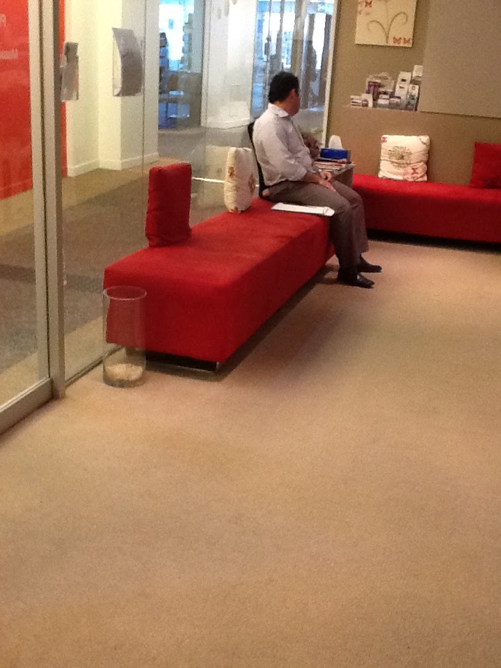
Apart from anything else, I couldn't wait to get rid of those saggy cushions - not a good advert for a chiropractor's office!
The one thing that was staying was the reception desk, so with it's distinctive timber finish, the scheme had to start from there ....
What about this, I say to the team ...
No, too close to what we already have, they said. And I agreed, I just wanted to give 2 options ;-)
Ok, so how about this for a brand new look?
Now we're talking. WE LOVE IT, they said.
Me too, but what about a bit more life, to really tie in the veneer on the desk?
SOLD! And here is the result ....
Check out this pic then scroll back up to the first one - big improvement?
Spot the details ....
The team at AV Chiro are a lively and fun bunch, so I knew they'd go for the humour of the "I Feel Good" fabric for the round ottomans (which I grabbed for $40 from a secondhand hotel furniture dealer). I couldn't be happier with these - might consider making them for sale!
And wonderful Grace Garrett fabrics from Emily Ziz liven up the scheme with Bamboo Poles (which reminded the chiros of a cross-section of spinal bones!!) in Silt and Sulphur. Same design as my bathroom wallpaper in a smaller scale.
I designed the cushions and had them custom-made to provide firm spinal support when you're sitting on the ottomans, which themselves were re-upholstered in a shimmery teal fabric.
The red-orange wall in the outside corridor - which the poor girls on reception had to look at all day - was painted out in Dulux Duck Egg Blue. It's incredibly calming.
And thanks to the amazing guys at Commex for the final touch - the silver lettering on the reception desk - no more pebbles!
Love my job!
Til next time,
Nx
Greetings from a sunny/rainy/sunny/rainy, altogether beautiful Bris-Vegas. What's news? What's been happening in your part of the world lately?
Lately for me, design-wise, it's all been about finishing touches - the hardest part of any design project, I think, is the last 5%! So it's finally time to share my most enjoyable work of the year so far, which was the refurb of the reception area and office space at my chiropractor in the city, Andrew Vincent Chiropractic.
After my regular adjustment one day, what started as a simple question about which carpet the team at AV Chiro should go for turned into a full-blown project to revamp the whole office look. I was SO glad that a new look was planned - I had wanted to say for AGES that I though the office was a wee bit tired and not really reflective of the practice and their great brand & reputation.
Apart from anything else, I couldn't wait to get rid of those saggy cushions - not a good advert for a chiropractor's office!
| Before .... |
No, too close to what we already have, they said. And I agreed, I just wanted to give 2 options ;-)
Ok, so how about this for a brand new look?
Now we're talking. WE LOVE IT, they said.
Me too, but what about a bit more life, to really tie in the veneer on the desk?
SOLD! And here is the result ....
Check out this pic then scroll back up to the first one - big improvement?
Spot the details ....
The team at AV Chiro are a lively and fun bunch, so I knew they'd go for the humour of the "I Feel Good" fabric for the round ottomans (which I grabbed for $40 from a secondhand hotel furniture dealer). I couldn't be happier with these - might consider making them for sale!
And wonderful Grace Garrett fabrics from Emily Ziz liven up the scheme with Bamboo Poles (which reminded the chiros of a cross-section of spinal bones!!) in Silt and Sulphur. Same design as my bathroom wallpaper in a smaller scale.
I designed the cushions and had them custom-made to provide firm spinal support when you're sitting on the ottomans, which themselves were re-upholstered in a shimmery teal fabric.
The red-orange wall in the outside corridor - which the poor girls on reception had to look at all day - was painted out in Dulux Duck Egg Blue. It's incredibly calming.
And thanks to the amazing guys at Commex for the final touch - the silver lettering on the reception desk - no more pebbles!
Love my job!
Til next time,
Nx
Wednesday, 10 October 2012
What a difference new floor, walls, tiles, paint and a skylight make
Hello, hello everyone.
Heavens to Murgatroyd, it's been AGES since my last post! In the past few months, I have spent wonderful and memory-packed times with family over here from Scotland, completed two really fun design jobs, worked Saturday mornings at Masters North Lakes as a Colour Consultant for Wattyl and started a second small business (more on that much later).
Never a dull moment - wouldn't know what to do with myself if I had one :-)
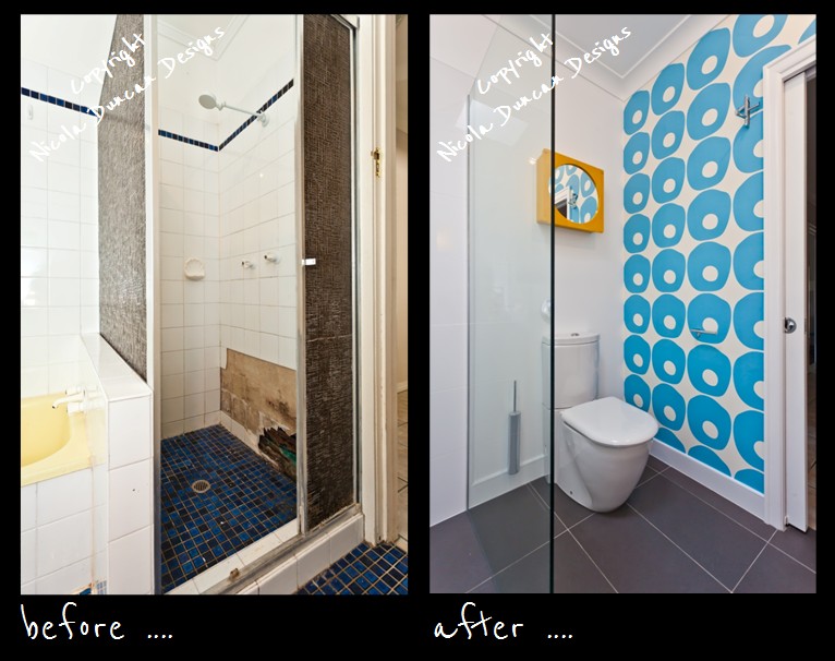
Sooooo, there have been a few photos here and there on my new FB page - Nicola Duncan Designs - of the new bathroom, but to round it all off, I thought I'd share some of the before and after shots that I commissioned from my friendly real estate photographer Todd.
Here you go ....
Things I love most?
- the new skylight: it floods this small space with natural light, all for less than $500
- the shower stall: it's huge and I now have a place to put my foot to shave my legs
- the cabinet that's concealed behind the Michael Murphy print (btw, I bought this print, asked the artist Michael if I could reproduce it on the cabinet door, and the amazing chaps at Commex scanned the artwork and printed it directly onto the door)
- my splurge: I put this light on every morning while I have my shower
- and the surprise you get when you turn around and see the wallpaper.
Thanks for reading/looking! Hope you enjoyed.
If you haven't already, why not join me over at Nicola Duncan Designs for lots of tips, info, giveaways and product stuff of a designery nature. And please feel free to 'Like' if you like and pass onto your friends :-)
Til next time,
Nx
Heavens to Murgatroyd, it's been AGES since my last post! In the past few months, I have spent wonderful and memory-packed times with family over here from Scotland, completed two really fun design jobs, worked Saturday mornings at Masters North Lakes as a Colour Consultant for Wattyl and started a second small business (more on that much later).
Never a dull moment - wouldn't know what to do with myself if I had one :-)
Sooooo, there have been a few photos here and there on my new FB page - Nicola Duncan Designs - of the new bathroom, but to round it all off, I thought I'd share some of the before and after shots that I commissioned from my friendly real estate photographer Todd.
Here you go ....
![]() |
| On the left, original 50s styling! On the right: ceramic floor tile by Complete Tiles & Stone, Shower Exposure Rail System 2 by Methven, Feature mosaic 'Carnival' from Classic Ceramics, Basin bench Caesarstone Osprey, Taps by Grohe, Basin & WC both reclaimed, Underbench drawer, stool & medicine cabinet - all vintage finds. |
![]() |
| Bamboo Poles wallpaper in Horizon Blue by Grace Garrett, available from emilyziz.com. Wall-hung loo brush & holder from Argent, loo also has soft-closing lid (which means I slam every other toilet lid I use!) |
![]() |
| My splurge, Muse wall light from Axo. It's a wire frame with a soft fabric cover - looks like a sea urchin! Wall storage/cabinet is concealed behind the Michael Murphy image, with a mirror on the inside of the door. |
Things I love most?
- the new skylight: it floods this small space with natural light, all for less than $500
- the shower stall: it's huge and I now have a place to put my foot to shave my legs
- the cabinet that's concealed behind the Michael Murphy print (btw, I bought this print, asked the artist Michael if I could reproduce it on the cabinet door, and the amazing chaps at Commex scanned the artwork and printed it directly onto the door)
- my splurge: I put this light on every morning while I have my shower
- and the surprise you get when you turn around and see the wallpaper.
Thanks for reading/looking! Hope you enjoyed.
If you haven't already, why not join me over at Nicola Duncan Designs for lots of tips, info, giveaways and product stuff of a designery nature. And please feel free to 'Like' if you like and pass onto your friends :-)
Til next time,
Nx
Wednesday, 20 June 2012
Mirror, Mirror
Just time for a quick post on a fun project I did yesterday.
While my tastes might change constantly and I might ooh and aah over very different things from one week to the next, even one day to the next, there are definitely 2 constants for me when it comes to decorating:
1. Why spend more than you have to?
2. Personalise, personalise, personalise.
Which is why I love Ikea hacking! Yes, buy budget, but don't let your home look like everyone else's who shops at the big blue and yellow shed.
So here's what I did with a $14.99 mirror known as RAM (don't you love some of those Ikea names?)
And yes, those are pages from my old Dulux paint colour fan deck ....
I stuck them all the way round the boring timber frame, roughly following the colour wheel to give it a more seamless affect.
And you can just see here that I also stuck contrasting colours on the back of each strip - that way you can see colours reflected in the mirror as well.
Apart from the look, it's fun to do my hair or makeup in front of this mirror and notice the names of the colours - like Hot Lips or Fluffy Duck. Makes me smile!
For more fun ways to personalise your Ikea furniture, check out Ikea hackers and This is My Ikea.
Have a great week, everyone!
Til next time, Nx
While my tastes might change constantly and I might ooh and aah over very different things from one week to the next, even one day to the next, there are definitely 2 constants for me when it comes to decorating:
1. Why spend more than you have to?
2. Personalise, personalise, personalise.
Which is why I love Ikea hacking! Yes, buy budget, but don't let your home look like everyone else's who shops at the big blue and yellow shed.
So here's what I did with a $14.99 mirror known as RAM (don't you love some of those Ikea names?)
And yes, those are pages from my old Dulux paint colour fan deck ....
I stuck them all the way round the boring timber frame, roughly following the colour wheel to give it a more seamless affect.
And you can just see here that I also stuck contrasting colours on the back of each strip - that way you can see colours reflected in the mirror as well.
Apart from the look, it's fun to do my hair or makeup in front of this mirror and notice the names of the colours - like Hot Lips or Fluffy Duck. Makes me smile!
For more fun ways to personalise your Ikea furniture, check out Ikea hackers and This is My Ikea.
Have a great week, everyone!
Til next time, Nx
Friday, 25 May 2012
I've got sunshine on a rainy day
Happy Friday one and all. So how's the week been?
Things have been hectic here, busy busy with fun and interesting client work. I'm blessed. You know, I still have to pinch myself that it's less than 2 years since I said goodbye to corporate life and threw myself onto the roller coaster yet again - can't believe it!
My dining room table was a fun and messy place to be yesterday, with fabric and paint swatches strewn all over the place as I played with pulling together delicious and enticing pallettes for my clients - perhaps my favourite part of this job. Hours pass, I forget to eat - and I might get a teeny wee bit obsessed with finding exactly the right colour or pattern, or combo of both!
Which leads me to my point ....
Slowing life down was a big part of this whole change, mid-life 're-appraisal', call it what you will! I didn't give up what I was doing before and risk disappearing into professional oblivion just to repeat the pattern of 'gotta be amazing, gotta give it my all', always at the cost of my energy and own inner peace.
So no matter how much I love what I now do - and you KNOW how much I love it - I know I still need to make sure I take time to stop and smell the roses, well my version of that anyway. So these photos that I wanted to share with you today are my version of that famous old cliche ....
Looking through my camera lens at a flower as intricate and beautiful as the Bird of Paradise, as close as I can get, makes time stand still. How can I not feel joy when I see the colours, textures and shapes of this marvellous little part of our universe?
They're not roses.
And they don't smell.
But they are my sunshine on a rainy day like today.
Til next time,
Nx
Things have been hectic here, busy busy with fun and interesting client work. I'm blessed. You know, I still have to pinch myself that it's less than 2 years since I said goodbye to corporate life and threw myself onto the roller coaster yet again - can't believe it!
My dining room table was a fun and messy place to be yesterday, with fabric and paint swatches strewn all over the place as I played with pulling together delicious and enticing pallettes for my clients - perhaps my favourite part of this job. Hours pass, I forget to eat - and I might get a teeny wee bit obsessed with finding exactly the right colour or pattern, or combo of both!
Which leads me to my point ....
Slowing life down was a big part of this whole change, mid-life 're-appraisal', call it what you will! I didn't give up what I was doing before and risk disappearing into professional oblivion just to repeat the pattern of 'gotta be amazing, gotta give it my all', always at the cost of my energy and own inner peace.
So no matter how much I love what I now do - and you KNOW how much I love it - I know I still need to make sure I take time to stop and smell the roses, well my version of that anyway. So these photos that I wanted to share with you today are my version of that famous old cliche ....
Looking through my camera lens at a flower as intricate and beautiful as the Bird of Paradise, as close as I can get, makes time stand still. How can I not feel joy when I see the colours, textures and shapes of this marvellous little part of our universe?
They're not roses.
And they don't smell.
But they are my sunshine on a rainy day like today.
Til next time,
Nx
Friday, 18 May 2012
Delightful Friday
Is it true?
Can I really now blog on my iPad?
Is Blogsy the answer?
Well, that makes me just about as happy as this hotel spotted in May's edition of Livingetc ....
If this post works, then it is true!
P.S. In case you can't read it, this is the Saguaro Hotel in Palm Springs - if a little bit of colour might lift your spirits today, go here
Or just enjoy these shots of the guest rooms ...
Can I really now blog on my iPad?
Is Blogsy the answer?
Well, that makes me just about as happy as this hotel spotted in May's edition of Livingetc ....
If this post works, then it is true!
P.S. In case you can't read it, this is the Saguaro Hotel in Palm Springs - if a little bit of colour might lift your spirits today, go here
Or just enjoy these shots of the guest rooms ...
Friday, 11 May 2012
Bathroom Sneak Peek
Hello.
How are you?
It's been a while. 7 weeks to be precise.
Sometimes life just re-prioritises itself and you just go with it, because it's the right thing to do. I love blogging, I love writing, I love decorating, I love what I do - but I love people more. I love my friends and I love my family, both 'real' and extended. When they need me, I am there, and nothing else is important in that moment.
But life does go on and after 3 or so months showering in the 1970s afterthought of a bathroom under the house, enough is enough! Although I have to say that the co-ordination of fittings down there (and I mean everything: hooks, towel rails, toilet seat, toilet roll holder and toilet brush, even 'feature' spots on the white tiles) is pretty impressive - isn't forest green in at the moment? They don't make 'em like they used to ....
So to ease myself back into blogland, I thought I'd give you a little 'sneak peek' at some of the key features in the new design ....
That's my favourite part. A late addition - and a bit of a splurge - but just the item I was looking for to really lift the design and make it unique.
Luckily I fell in love with a feature tile other then the beautiful Dwell/Heath Ceramics one that would cost me more to ship from the U.S. than it would to make and buy! A lesson learnt - never set your heart on something until you find out if you can 1. source it and 2. afford it!
Bathrooms can be hard to design, hard to make interesting. There are lots of lines and squares and hard surfaces and it can all end up feeling quite bland and cold. I'm a fan of looking at everything you put in there, such as taps, shower heads, rails, handles & holders, and especially lighting, to see what you can do to lift the design and make it feel like a real room, not a utility area.
Clever storage is another 'must' of mine. Can't wait to show you how this picture (or one similar as the final selection hasn't been made yet) will be used in my pocket-size powder room.
Well, it is nice to be back. I hope you're still there!
'Til next time, take good care of you and the people you love, Nx
How are you?
It's been a while. 7 weeks to be precise.
Sometimes life just re-prioritises itself and you just go with it, because it's the right thing to do. I love blogging, I love writing, I love decorating, I love what I do - but I love people more. I love my friends and I love my family, both 'real' and extended. When they need me, I am there, and nothing else is important in that moment.
But life does go on and after 3 or so months showering in the 1970s afterthought of a bathroom under the house, enough is enough! Although I have to say that the co-ordination of fittings down there (and I mean everything: hooks, towel rails, toilet seat, toilet roll holder and toilet brush, even 'feature' spots on the white tiles) is pretty impressive - isn't forest green in at the moment? They don't make 'em like they used to ....
So to ease myself back into blogland, I thought I'd give you a little 'sneak peek' at some of the key features in the new design ....
![]() |
| via Lighting55.com |
That's my favourite part. A late addition - and a bit of a splurge - but just the item I was looking for to really lift the design and make it unique.
Luckily I fell in love with a feature tile other then the beautiful Dwell/Heath Ceramics one that would cost me more to ship from the U.S. than it would to make and buy! A lesson learnt - never set your heart on something until you find out if you can 1. source it and 2. afford it!
![]() |
| via Methven |
Bathrooms can be hard to design, hard to make interesting. There are lots of lines and squares and hard surfaces and it can all end up feeling quite bland and cold. I'm a fan of looking at everything you put in there, such as taps, shower heads, rails, handles & holders, and especially lighting, to see what you can do to lift the design and make it feel like a real room, not a utility area.
![]() |
| via happilyeverafterinseattle |
Clever storage is another 'must' of mine. Can't wait to show you how this picture (or one similar as the final selection hasn't been made yet) will be used in my pocket-size powder room.
Well, it is nice to be back. I hope you're still there!
'Til next time, take good care of you and the people you love, Nx
Subscribe to:
Posts (Atom)